THE AMAZING SPIDER-MAN
SPIDER-MAN
SPIDER-MAN
PETER PARKER
AUNT MAY
GWEN STACY
MARY JANE
HARRY OSBORN
FLASH THOMPSON
CURT CONNORS
J. JONAH JAMESON
NORMAN OSBORN
THE GREEN GOBLIN
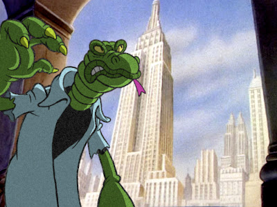
THE LIZARD
ELECTRO
DOCTOR OCTOPUS
KRAVEN THE HUNTER
THE SANDMAN
THE RHINO
MYSTERIO
THE VULTURE
THE SCORPION
BLACK CAT
THE CHAMELEON
VENOM
SPIDER SLAYER
CAT ON THE PROWL
DOOMS DAY IN NEW YORK
THE LIZARD SEEKS REVENGE
CHANCE MEETING
CAUGHT RED HANDED
YOU HAVE BEEN WARNED
STREET FIGHT
I did a drawing of Spider-man with a nose and "Popeye" arms as couple of years ago and I loved it. Now I have put that doodle in his world with all his friend and foes.
Obviously I used a lot of "Popeye" reference in this project with some tweaking on other design elements. 1930 Fleischer Studios cartoon have been a favorite of mine and this was a good excuse to dabble in that world. And of course I did some mock-up screen shoots to get a glimpse of what it might look like on the big screen at that time in history.
Hope you enjoy it as much as I did drawing it.


8 comments:
These are fantastic bro! Nice work. I forwarded it on to the folks at Project Rooftop.
These are hilarious. There great.
Would be even greater if the women's outfits were period like the guys'.
To the Postmaster - The women's outfits are very much period pieces. They are from the later 30's and they look is from college kids and vacation wear. It is just not the standard flapper look you usually see in period shows and movies for the 30's. I was going to give them hats, but it took to much away from there character.
I dunno dude, the flapper look was the twenties. Just sayin'. And the female outfits may be sort of period but you've got them fitting in a modern style. You have Mary Jane's pants sitting like low riders instead of at the waist, and a skintight singlet top. She actually looks quite Spumco. Same goes for Gwen. No way anyone was wearing that skirtlength back then or those boots. Having said that though, great stuff man! And Aunt May as Olive is inspired. Love the ones where you degraded the 'cel' characters to the quality of the background, like the Lizard one. Looks awesome compared to the modern-looking quite-sharp one. It'd be super cool if you discoloured/aged the character colours down to the backgrounds as well. I'd love to see you do a thirties less tapered linestyle too.
Also love the SW and WT 'Pixar' stuff you did. Awesome Phil!
WOW! THAT IS EXCELLENT!
I really like the next-to-last image. That one looks like it could be right out of a Fleischer Color Classic.
I have to say...this is one of the most genius things I've seen. As a fan of both Popeye and Spider-man, I commend you for creating this amazing tribute. Gorgeous artwork. The models are perfect. Don't change a thing. I like the fact that some of the outfits look period and others aren't. It makes it funnier and goofier.
Post a Comment